In this article

Photography

/

Taze Creative

11 product photography blunders your brand can’t afford to make

11 product photography blunders your brand can’t afford to make

11 product photography blunders your brand can’t afford to make

product bottle design

Source:

Source:

Taze Creative

Taze Creative

11 Don’ts of product photography that will boost your e-commerce sales

11 Don’ts of product photography that will boost your e-commerce sales

Product photography is a critical factor in ecommerce success. Poor images can turn potential customers away, while well-executed ones can drive sales. Here are 11 common mistakes in product photography that, when avoided, will significantly improve your ecommerce sales:

1. One shot isn’t enough — Capture 2-5 stunning angles of your product

1. One shot isn’t enough — Capture 2-5 stunning angles of your product

Having just one image of your product isn’t enough to engage potential buyers or give them the confidence to make a purchase. Multiple images allow customers to examine your product from different angles and help them visualize it in use. In fact, providing 3-5 images per item can significantly increase the probability of converting an ecommerce user into a buyer.

Why more images matter

  • Higher priced items demand more visuals: The closer your product is to premium pricing, the more images shoppers expect. A single image isn’t sufficient to justify a premium price. A well-rounded selection of shots shows attention to detail and reassures the customer that the product is worth the investment.

  • Show details, Especially for handmade products: With handmade pieces, capturing close-up details is crucial. A slight imperfection in the hand-stitched seam of an artisanal blouse or a potter’s hands working on the wheel can tell a story. These elements highlight craftsmanship and authenticity, offering an emotional connection with the buyer.

  • Cover multiple angles: Take shots from the front, back, side, or 45-degree angles. Use a mix of full-size shots and close-ups to showcase design features or textures. This strategy is especially effective for apparel or accessories where customers want to visualize how the item looks from all perspectives.

Different photography concepts to explore

  • Lay Flat: Perfect for clothing, where customers want to see the full product.

  • Ghost Mannequin: A great way to show how clothing drapes naturally, while maintaining the product as the sole focus.

  • Isolated Shots: Clean images with no distractions keep the focus on the product.


minimalist bottle design

2. Retouching in product photography: Not the place to cut costs

2. Retouching in product photography: Not the place to cut costs

Retouching is a crucial part of the product photography process. It can elevate an already great image or correct minor imperfections in a photo, but when done poorly or excessively, retouching can severely damage the quality of your images and harm your brand's credibility. While it's tempting to cut corners and save on retouching, this is one area where investing in quality work pays off.

Why retouching matters

Retouching can enhance the finer details of your product—whether it’s removing dust spots, fixing small imperfections, or ensuring that the colors are accurate. However, even the best retouching can’t transform a poorly shot image into a great one. The foundation of the photo must be strong for retouching to work effectively.

Two common retouching mistakes

  1. Over-retouching: One of the most common errors is using too much retouching. Over-editing can make a product look artificial or unappealing, and customers may feel misled if the product doesn’t match the exaggerated photo when they receive it. Subtlety is key in retouching—make adjustments that enhance the image without changing its natural look.

  2. Poor retouching: On the flip side, poorly done retouching can make an image look sloppy and unprofessional. Visible editing marks, inconsistent colors, or uneven lighting corrections can distract customers and make your product appear less polished. This can reflect poorly on your brand and discourage potential buyers.

Balancing retouching for best results

  • Focus on natural enhancements: Retouching should be used to refine the image while keeping the product’s natural essence intact. For example, clean up small defects or blemishes, but don’t alter the product to the point where it looks different from what customers will receive.

  • Correct imperfections, Don’t mask reality: Correcting lighting issues, sharpening details, and making colors pop can improve an image, but avoid retouching that distorts the product’s reality. Your goal is to enhance, not mislead.

Conclusion: Quality retouching sells

Retouching is an investment, not a cost-saving opportunity. When done right, it improves the image quality and helps showcase your product’s best features, ultimately driving sales. However, if done poorly or excessively, it can result in unnatural, unattractive images that turn potential customers away. Always aim for professional, well-balanced retouching to maximize the appeal of your product images.
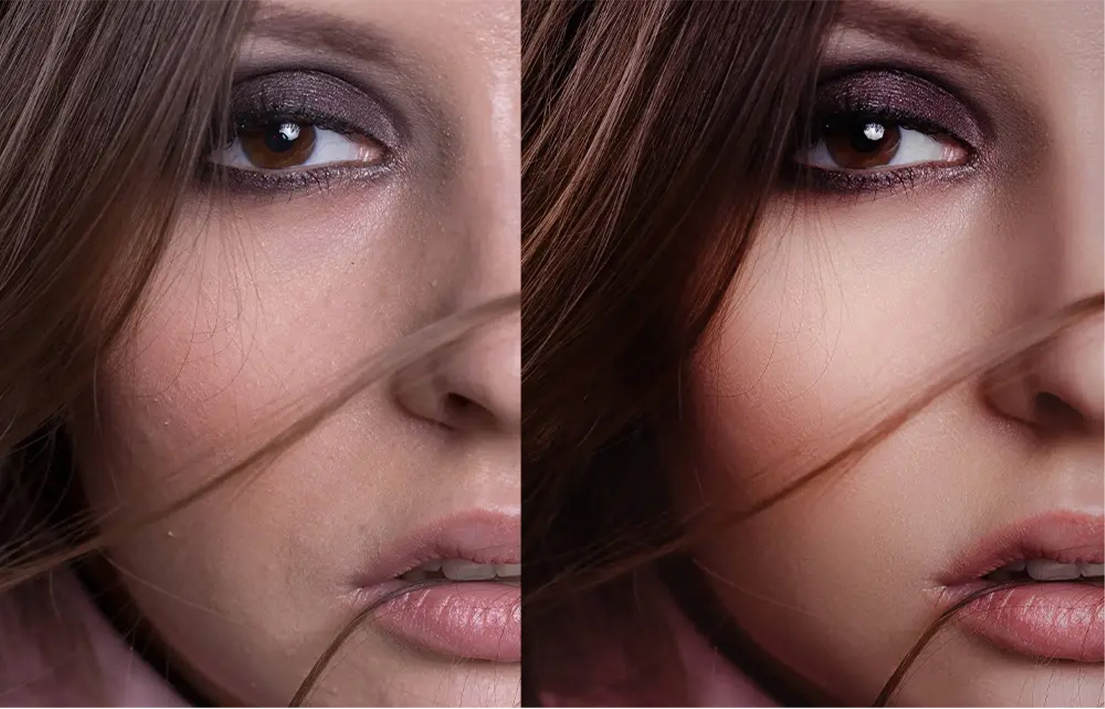
editing design photography


3. Don’t underestimate the background: It makes your product stand out and retouching easier

3. Don’t underestimate the background: It makes your product stand out and retouching easier

The background plays a more important role in product photography than many people realize. A well-chosen background can make your product stand out and significantly streamline the retouching process. Even if you don’t have professional equipment, creating a clean and polished background is a crucial step in achieving high-quality images.

The ideal background setup

For most ecommerce platforms, a #FFFFFF white background is the industry standard, especially for Amazon and Shopify. This ensures the product is the sole focus of the image without any distractions. Fortunately, you don’t need expensive tools to achieve this look. A simple solution involves:

  • White vinyl or plastic sheet: Purchase a piece of white vinyl or plastic from your local hardware store. This flexible yet durable material can be easily attached to a table using clips, with the other end propped up against a wall to create a seamless curve. This setup eliminates harsh lines or shadows and gives your product a clean, floating appearance.

Why the white background works

  • Focus on the Product: A white background removes distractions and highlights the product, ensuring customers see every detail clearly. It also creates a professional and consistent look across your ecommerce store.

  • Easier Retouching: A seamless white background simplifies the editing process. You won’t have to worry about removing distracting elements or correcting inconsistent lighting, allowing you to focus on enhancing the product itself.

Exploring other background options

If you want to get creative with your product photos, colored or black backgrounds can make for stunning visuals. However, these options require more expertise with lighting and retouching, as they tend to cast shadows and affect color accuracy. For most ecommerce platforms, it’s best to leave these more complex shots to professionals who can ensure the lighting and background enhance, rather than detract from, the product.

Conclusion: Keep it simple and professional

A well-prepared background is a game-changer in product photography. Not only does it make your product stand out, but it also reduces the time and effort needed for post-production editing. While creative backgrounds can work for certain products, a white background remains the gold standard for ecommerce. Whether you’re using vinyl, plastic, or a DIY setup, investing in a clean background setup ensures your product photos look polished and professional.
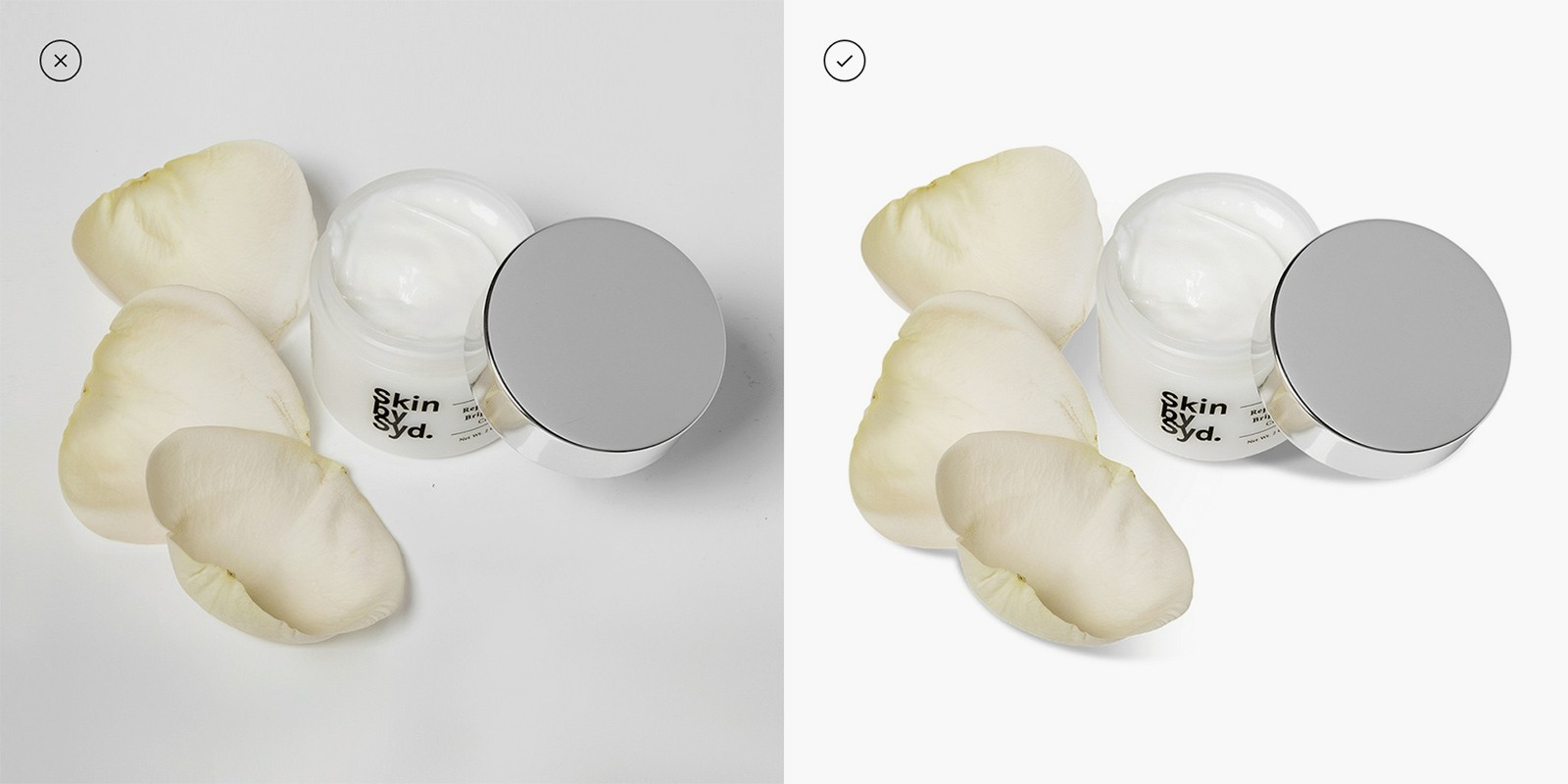
white background product photography

4. Don’t take light lightly: It’s a shadowy business

In product photography, lighting is just as important as the camera and lens—perhaps even more so. Just like alcohol at a party, too little lighting can make your product shots look dull and lifeless, while too much lighting can create harsh shadows and overexposed images. Striking the right balance is essential to achieving well-lit, professional-looking product images.

Why lighting is crucial

Lighting sets the mood, enhances texture, and reveals the details of your product. It also affects color accuracy, depth, and shadow control, all of which contribute to the final quality of the image. Without proper lighting, even the best camera won’t capture a product’s true beauty.

Professional lighting equipment

When you talk about professional photography, lighting is a significant part of the conversation. Expensive equipment such as:

  • Front, back, overhead, and side lights

  • Softboxes to diffuse light evenly

  • Reflectors to bounce light onto your product

  • Fill lights to minimize shadows

These tools are ideal for achieving perfect lighting, but they can be costly and require expertise.

DIY lighting: A budget-friendly solution

If you don’t have access to professional lighting equipment, you can still create high-quality product photos by making the most of natural light and a few inexpensive DIY setups. Here's how:

  • Natural Light: Utilize daylight, preferably near a large window, to create soft and even lighting. Turn off other light sources in the room to avoid color contamination.

  • Table lamp stands: Using a couple of adjustable gooseneck table lamps is a cost-effective way to control light direction. Position these lamps at different angles to avoid harsh shadows and bring out the product’s details.

  • DIY softbox: Create a softbox using simple materials like a cardboard box, white paper, and diffusing materials (e.g., white fabric or parchment paper). A softbox helps to diffuse harsh light and create a more even, flattering illumination on your product.

Key lighting considerations

  • Intensity: Adjust the brightness of your light source to match the product’s surface. For shiny objects, softer light is best to avoid harsh reflections. For textured products, stronger lighting can bring out details.

  • Temperature and Tone: Light temperature (measured in Kelvin) affects how warm or cool the colors appear in your photo. Use consistent lighting to ensure your product’s colors remain accurate.

Experiment and find your lighting sweet spot

Take multiple test shots using different angles, light intensities, and reflector placements to find the right balance of shadows and highlights. Once you find the perfect lighting setup, maintain it for all product shots to achieve a consistent look across your images.

Conclusion: Lighting is everything

Don’t underestimate the power of good lighting in product photography. Whether using natural light or a few DIY tools, lighting plays a vital role in capturing the details, textures, and colors of your product. Experiment with different setups, and once you’ve nailed the right balance, stick to it for a consistent, professional look in your product photography.

lighting photography


5. Saving on the tripod may backfire: Ready, Steady, Shoot

5. Saving on the tripod may backfire: Ready, Steady, Shoot

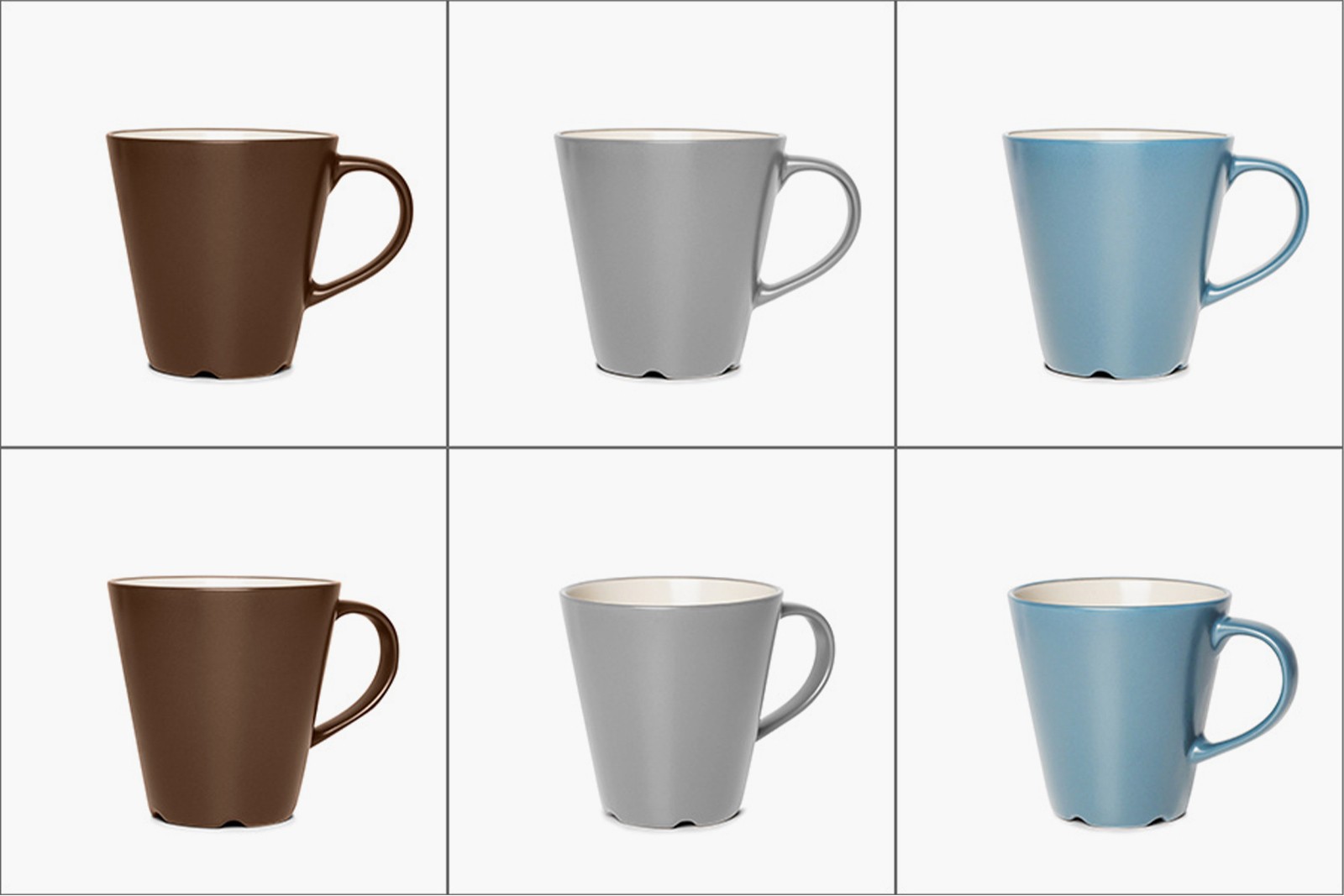
In product photography, consistency is key, especially when you’re photographing a series of items for an ecommerce store. Each product needs to be displayed with the same level of professionalism, ensuring a uniform and cohesive look across your website. One of the most essential tools for achieving this consistency is a tripod.

Why a tripod is Non-negotiable

A tripod provides stability and consistency in your photography setup. Without a tripod, your shots are prone to:

  • Blurring: Even the slightest movement can result in a blurry photo, especially when using a slower shutter speed for proper lighting.

  • Inconsistent angles: Handheld shots can vary in height and angle, making it difficult to keep products aligned uniformly across your images.

  • Inconsistent distance: A tripod helps maintain the same distance between your camera and the product, ensuring all items are framed consistently.

Achieving consistency with a tripod

For ecommerce photography, it’s crucial that each product image looks like it belongs to the same series. A tripod allows you to:

  • Keep the object placed in the same spot in every shot.

  • Maintain a consistent distance between the camera and the product.

  • Ensure consistent lighting and focus from one image to the next.

The importance of depth of field

Using a tripod also helps you achieve a wide depth of field, which is critical for keeping your product in sharp focus. With the camera stabilized, you can lower the aperture (increase the f-stop number) to achieve greater depth of field and use a slower shutter speed without worrying about camera shake. This ensures that all parts of the product remain crisp and clear, enhancing the overall quality of your images.

Affordable tripods: A smart investment

You don’t need to break the bank to get a reliable tripod. A basic tripod starts at around $25 and can last for years. This small investment will:

  • Improve the quality of your photos.

  • Save time during your shoot by eliminating the need to reposition or stabilize your camera repeatedly.

  • Provide the consistency you need for a professional-looking ecommerce store.

Conclusion: Stability equals professionalism

A tripod is one of the most affordable yet critical tools in product photography. It guarantees stability, consistency, and clarity—essential elements for producing professional product images. Don’t skimp on this tool; a tripod will elevate the quality of your photography and ensure your ecommerce store looks polished and trustworthy.
different color cups

6. Using striking models: Keep the spotlight on your product

6. Using striking models: Keep the spotlight on your product

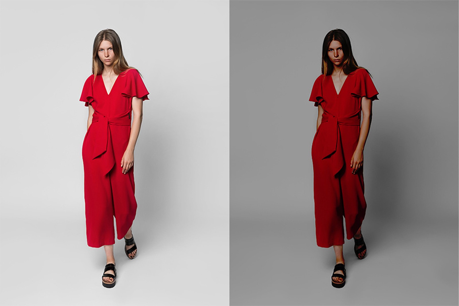
Using models in product photography is a powerful way to show your products in use and help customers visualize how they might look or function in real life. However, when the model overshadows the product, the focus shifts away from what you’re trying to sell. Product photography with models is its own specialized segment, and getting it right requires adhering to key principles.

Rules for product photoshoots with models

  1. Choose the right model for your target audience

It’s essential to choose a model that resonates with your target audience. Don’t simply pick a model based on appearance alone—think about how well the model represents your brand and connects with the people you want to reach. Your model should complement the product, not distract from it.


  1. Avoid overpowering the product

The model should support the product, not dominate it. The goal is to make the product the hero of the shot. While a model can bring personality and life to the image, it’s crucial that they don’t steal attention from the product.

Ensure that the model’s pose, expression, and styling direct focus toward the product. A subtle pose and natural, relaxed expression work better than forced or exaggerated poses.


  1. Natural, Relaxed expressions over stock-style smiles

Gone are the days of overly staged, stock-photo-style smiles. A natural, calm expression often feels more authentic and can help sell the lifestyle or mood of the product better than a forced smile. This is especially true for fashion, lifestyle, and high-end products.


  1. "Product first, Model second" Mantra

Both the model and the photographer need to remember the mantra: Product first, model second. The model is there to enhance the product, not compete with it. This applies to everything from posing to clothing and accessories. The product should be the center of attention in every shot, and the model should simply be a vehicle to highlight its features.


  1. Shoot at Eye-Level

Shooting from extreme angles (either too high or too low) can make the model appear unnatural and take away from the product’s presentation. Eye-level shots create a more realistic and approachable feel, keeping the viewer’s attention on the product while ensuring the model looks natural and aligned with the overall composition.


Conclusion: Keep the product in the spotlight

When using models for product photography, it’s vital to strike the right balance. The model should enhance the product, not overpower it, visually or mood-wise. By focusing on natural expressions, choosing the right model for your audience, and maintaining the "product first" mentality, you’ll create engaging, high-quality images that help drive sales while keeping the spotlight on the product.

7. Getting too creative with angles and product positioning: Stick to the basics

7. Getting too creative with angles and product positioning: Stick to the basics

While creativity is valuable in many aspects of marketing, product photography for ecommerce requires a more straightforward approach. The goal is to provide potential buyers with a true-to-life portrayal of your product, allowing them to make an informed purchasing decision. Overly creative angles and unconventional positioning may seem intriguing, but they often detract from the product’s functionality and can confuse customers.

Why simplicity wins for ecommerce photography

Unlike social media, where you might play with creative elements to grab attention, ecommerce photography needs to be clear and consistent. The focus is on realism and showing your product accurately, without distortion or confusion. The more straightforward and comprehensive your images, the easier it is for customers to visualize the product.

Essential angles for ecommerce product photography

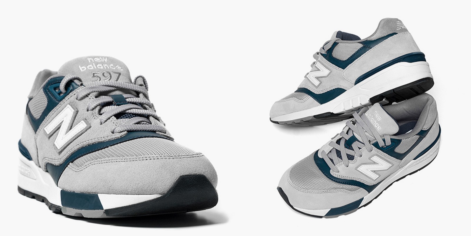
  1. Front shot: This gives the customer a direct view of the product and is usually the first image they see. It provides a full, straightforward representation of the item.

  2. Back shot: The back shot is equally important, especially for clothing, electronics, or anything where the rear features matter (e.g., buttons, ports, or zippers).

  3. 45-degree shot: The 45-degree angle is one of the most appealing angles for products. It offers a more dynamic view, revealing the depth and structure of the item. This angle works well as the hero image for many products because it captures more details than just the front or back alone.

Bonus shots to enhance the product

  • Close-Ups: Include close-up shots to show the finer details, such as textures, stitching, logos, or other intricate design elements.

  • 360-Degree Photography: If you have the resources, offering a 360-degree view allows customers to interact with the product virtually, giving them a more immersive shopping experience.

Why avoid over-creativity in angles?

  • Inconsistency: If you use creative or extreme angles, it becomes harder to replicate the same style across a series of products. This leads to a disjointed product catalog, where some images look professional and others look amateurish or hard to interpret.

  • Customer confusion: Overly artistic angles can distort the product’s actual size, shape, or function, making it harder for buyers to understand what they’re purchasing. Ecommerce customers expect realism, not artistic flair, from product images.

Conclusion: Stick to the classical trio

For an ecommerce store, the front, back, and 45-degree shots are the foundation of effective product photography. While a few close-ups or a 360-degree view can enhance the customer experience, too much creativity with angles and positioning can lead to confusion and inconsistency. Keeping it simple and realistic ensures customers get a clear, accurate representation of your product, which ultimately leads to better decision-making and increased sales.

shoe angle reference


8. Striking the perfect balance: Avoiding exposure pitfalls in product photography

8. Striking the perfect balance: Avoiding exposure pitfalls in product photography

One of the most critical elements of product photography is exposure, which refers to how much light reaches your camera’s sensor. Improper exposure can make or break your images. Whether the photo is overexposed (too bright) or underexposed (too dark), it will severely impact how your product is perceived by potential customers. Either extreme makes it difficult for customers to see the product accurately, which can hurt your sales.

Why exposure matters

  • Overexposure: When an image is overexposed, the highlights are blown out, and important details are lost in bright, white patches. This can make the product look washed out, with colors appearing inaccurate and textures missing.

  • Underexposure: Underexposed images, on the other hand, lack the necessary light, making them look dark and shadowy. Customers won’t be able to see the product clearly, and the colors will appear dull.

Both extremes can give customers an inaccurate impression of the product, leading to disappointment when the product doesn’t meet expectations, which can increase returns and harm your brand's reputation.

Mastering exposure: The right balance

Achieving the correct exposure involves balancing three key camera settings—shutter speed, aperture, and ISO:

  1. Shutter speed: Controls how long the camera's sensor is exposed to light. A slower shutter speed allows more light in, but can cause motion blur if not stabilized. A faster shutter speed reduces light exposure but keeps fast-moving subjects sharp.

  2. Aperture (f-stop): The aperture controls how much light enters the lens. A wider aperture (low f-stop number) lets in more light and creates a shallow depth of field. A narrower aperture (high f-stop number) lets in less light but provides greater depth of field, keeping more of the product in sharp focus.

  3. ISO: This setting determines the camera’s sensitivity to light. A lower ISO setting results in less noise but requires more light, while a higher ISO can brighten an image but may introduce grain or noise.

By adjusting these three elements, you can fine-tune the exposure and find the right balance for your product photography.

Learning resources

Mastering exposure takes practice, especially if you're new to product photography. A great resource for learning more is the book "Stunning Digital Photography", which includes an in-depth explanation of how to balance shutter speed, aperture, and ISO. There are also many tutorial videos available, including one by the same author, that break down how to achieve the right exposure for your product shots.

Take test shots and adjust

Since lighting conditions vary depending on your setup, it’s essential to take test shots and review them before proceeding with the final shoot. Use these test shots to adjust exposure settings until you’ve achieved the perfect balance—well-lit, clear, and accurate product images.

Conclusion: Tame your exposure for perfect results

Exposure is a critical aspect of product photography that requires attention and care. Overexposed or underexposed images can turn potential customers away, leaving them frustrated with unclear or unrealistic representations of your products. Take the time to experiment and learn how to manage shutter speed, aperture, and ISO to get that perfect, balanced exposure. Proper exposure will ensure your products look their best, helping to increase sales and customer satisfaction.

standing women product photography

9. Less is more: Keep props minimal to highlight your product

9. Less is more: Keep props minimal to highlight your product

In the visually driven era of platforms like Instagram, it’s tempting to over-style product photos with too many props. However, when it comes to ecommerce photography, less is more. Overcrowded compositions can distract potential customers and take the focus away from the product you’re trying to sell.

Why minimalism works for ecommerce

  • Distraction-free: The more props you include in your image, the harder it becomes for customers to focus on the actual product. If customers can’t easily identify what you’re selling, they’re less likely to make a purchase.

  • Clear, Focused images: A simple setup—like a white background—keeps the attention on your product. This approach allows the customer to evaluate the item without any distractions, creating a clean, professional aesthetic that builds trust and clarity.

When to use props (and when to avoid them)

  • Use props sparingly: Props should only be used if they enhance the understanding of the product or its use. For example, a prop could demonstrate the scale of an item or show how it fits into a certain lifestyle. But if the prop doesn’t add specific value or clarity, it’s better left out.

  • Avoid props that compete with the product: If the prop is visually competing with the product—whether through bold colors, textures, or size—it’s likely taking attention away from what you’re selling. The product should be the hero of the image, and anything else should remain secondary.

The Case for a white background

A white background is often the best choice for ecommerce photography because:

  • It removes distractions, allowing the product to stand out.

  • It’s the default standard on major platforms like Amazon and Shopify, which require clean, distraction-free product images.

  • It helps customers focus solely on the product, which is key for online purchasing where they can’t see the item in person.

Conclusion: Keep It simple

While props can sometimes enhance the storytelling of your product, overcrowding an image with unnecessary elements steals attention from the main focus—your product. For ecommerce, simplicity is powerful. A clean background and minimal or no props ensure that the product remains the center of attention, helping customers make clear and informed decisions.

10.High-resolution images: Essential for boosting visual appeal and sales

10.High-resolution images: Essential for boosting visual appeal and sales

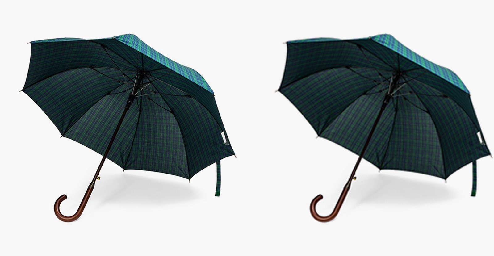
One of the most significant mistakes in ecommerce product photography is using low-resolution images. When customers shop online, they rely heavily on visuals to make purchasing decisions. High-quality images create trust and give potential buyers confidence in the product, while low-resolution images can have the opposite effect—making your product look cheap and unappealing.

Why high-resolution images matter

  • Professional appeal: High-resolution images look more professional, providing clarity and detail that allow customers to get a better sense of the product. A crisp, clear image is visually appealing and reflects the quality of the product itself.

  • Conveys value: A low-resolution image of a high-ticket item, such as a $10,000 Swiss watch, diminishes its perceived value, making it look cheap or untrustworthy. Conversely, a high-resolution image of a more affordable product, like a $10 watch, can make it appear much more expensive than it is, boosting its visual appeal.

  • Clarity and detail: High-resolution images allow customers to zoom in and explore the finer details of a product, whether it’s texture, stitching, or material quality. This is essential in an online shopping environment where the customer can’t physically touch the item.

Minimum resolution standards for ecommerce

The recommended minimum resolution for ecommerce product images is 1200px x 1200px. This size ensures the image remains clear when customers zoom in for a closer look, and it meets the standards of most ecommerce platforms.

  • Avoid pixelation: Low-res images tend to pixelate when zoomed in, making the product look unclear and unprofessional. High-res images, on the other hand, maintain sharpness and clarity, even when zoomed in.

  • Better conversion rates: Studies show that higher-quality images convert better. High-resolution product images build customer trust, leading to higher engagement, fewer abandoned carts, and more sales.

Conclusion: Invest in high-resolution images

Using high-resolution images is one of the easiest ways to improve the perception of your product and increase sales. Whether you’re selling premium items or mass-market products, professional-looking, high-resolution images provide the clarity, detail, and trust customers need to make a purchase. Avoid low-res images at all costs—your products (and sales) will thank you!

white background umbrella images

11.Strive for excellence: Don’t settle for mediocre work, Even if It’s your own

11.Strive for excellence: Don’t settle for mediocre work, Even if It’s your own

It may seem obvious, but accepting subpar product images—even ones you’ve painstakingly created yourself—is a mistake that can directly harm your sales. As a business owner, it’s natural to feel attached to the work you’ve put your heart and soul into, but emotional attachment should not cloud your judgment when it comes to your product images.

Why accepting subpar images is harmful

  • Poor Visuals = Poor Sales: In the world of ecommerce, first impressions are everything. Blurry, poorly lit images, or those with incorrect angles and shadows, make your product appear unprofessional and unreliable. These are visual cues that can turn potential customers away before they even take a second look.

  • Your Competitors Set the Bar: If your images don’t measure up to your competitors’, you’re already at a disadvantage. Shoppers will likely gravitate toward businesses that look polished and credible. One of the best ways to assess the quality of your images is to compare them to those of competitors whose photography you admire. If your images don’t come close to theirs, it’s time to either improve them or consider outsourcing.

Avoiding emotional attachment to subpar work

It’s easy to get attached to your own efforts, but professionalism must trump personal attachment. If the images aren’t helping your products shine, they shouldn’t be used, no matter how much time and effort went into creating them. The goal is to showcase the product in a way that builds trust, captures attention, and convinces customers to buy.

The power of professionally executed photography

Professionally done product photography has the power to:

  • Capture attention: Clear, high-quality images make customers stop and take a closer look.

  • Tell a story: Professionally shot images convey the quality and appeal of your product, helping potential buyers understand its value.

  • Drive sales: Great images build trust and convert shoppers into customers by allowing them to fully visualize the product and feel confident about their purchase.

Conclusion: Invest in excellence

Investing in high-quality, professionally executed product photography is one of the best ways to elevate your brand and increase sales. No business—no matter how big or small—can afford to compromise on the quality of their product images. If your DIY images fall short, it’s better to admit it and seek professional help than to risk hurting your business with subpar visuals. Good photography pays off, and in ecommerce, it’s an investment with one of the highest returns.

Ready to start your amazing project?

Ready to start your amazing project?

Ready to start your amazing project?

Say hello

Featured by

Say hi!

Contact Taze Creative today, and let's start the conversation about transforming your ideas into extraordinary digital experiences.

hello@tazecreative.com

+91 8148-331-189

LinkedIn

Behance

Dribble

© 2023-2025 Taze Creative Private Limited. All rights reserved.
Featured by

Say hi!

Contact Taze Creative today, and let's start the conversation about transforming your ideas into extraordinary digital experiences.

hello@tazecreative.com

+91 8148-331-189

LinkedIn

Behance

Dribble

© 2023-2025 Taze Creative Private Limited. All rights reserved.
Featured by

Say hi!

Contact Taze Creative today, and let's start the conversation about transforming your ideas into extraordinary digital experiences.

hello@tazecreative.com

+91 8148-331-189

LinkedIn

Behance

Dribble

© 2023-2025 Taze Creative Private Limited. All rights reserved.
Featured by

Say hi!

Contact Taze Creative today, and let's start the conversation about transforming your ideas into extraordinary digital experiences.

hello@tazecreative.com

+91 8148-331-189

LinkedIn

Behance

Dribble

© 2023-2025 Taze Creative Private Limited. All rights reserved.
ad city

/

Online Ads

Advertising is a strategic approach that uses paid messaging across different media platforms to shape consumer perceptions and drive actions. Its primary goal is to inform, persuade, and influence purchasing behaviors or enhance brand recognition by targeting specific audiences. Through this effort, businesses aim to engage consumers and ultimately increase sales or awareness.

ux design discussion

/

Design

Web design psychology is a multidisciplinary field that combines elements of psychology, user experience (UX) design, and visual design to understand how users interact with websites and how to make informed design decisions. By understanding user behavior, cognitive processes, emotions, and motivations, designers can create websites that are intuitive, engaging, and effective. In this section, we’ll explore the concept of web design psychology, its importance in today’s digital landscape, and its evolution over time.


What is web design psychology?

Web design psychology focuses on how users perceive, process, and react to various elements of web design. It involves studying user behavior and mental processes to create web designs that are easy to navigate, aesthetically pleasing, and aligned with user expectations. By incorporating psychological principles into web design, designers can influence how users experience a website, increasing satisfaction and driving actions such as purchases, subscriptions, or social shares.

The discipline covers several aspects of user interaction, including:

  • Cognitive Load: Reducing the mental effort required to use the website.

  • Visual Hierarchy: Directing user attention to the most important content first.

  • Emotional Engagement: Creating positive emotional responses that build trust and brand loyalty.


Evolution of web design psychology

The evolution of web design psychology has been shaped by technological advancements and the changing needs of users. In its early stages, web design was primarily concerned with aesthetics and functionality—ensuring websites were visually appealing and operational. However, as user behavior research expanded, it became evident that understanding how and why users interact with websites could lead to more effective designs.

Over time, web design psychology became a central part of UX design, integrating knowledge from fields such as:

  • Cognitive Psychology: Understanding how people think, learn, and remember.

  • Behavioral Psychology: Studying how users are influenced by stimuli and how they make decisions.

  • Sociology and Anthropology: Considering cultural and societal influences on user behavior.

With the rise of user-centered design and data-driven decision-making, the importance of web design psychology has grown. Today, designers use empirical research, user testing, and data analysis to build websites that align with user expectations, making it a core component of UX design.

As we continue, we’ll explore the key principles of web design psychology, such as visual hierarchy, cognitive load, and emotional engagement. These principles are crucial in shaping user experiences and will be illustrated through practical strategies, real-life examples, and case studies that show successful implementation. Let’s dive in and uncover the secrets of web design psychology!