Articles & News
Articles & News
Articles & News
Insights, work approaches, ideas. Read it all.
Insights, work approaches, ideas. Read it all.



Imagine this: after dedicating years to developing your product, you're finally ready to introduce it to the market. But what should your launch strategy be? Should you focus on traditional offline marketing, or expand your digital presence? In today's world, where a large portion of the population is online, neglecting the digital audience isn't an option. So, how do you engage with these potential customers? You need a website or app that delivers a seamless user experience, one that not only engages visitors but also converts them into customers.
Research indicates that a staggering 88% of online users abandon websites that provide a poor user experience. That’s a significant number of lost opportunities. This is where a professional UX design agency can step in.
So, what’s your next step? You should start the quest for the best UX design agency. They'll help you create a website or app that's not just aesthetically pleasing, but also intuitive, user-friendly, and drives results.
As the demand for UX design services grows, so does the number of agencies. This can make selecting the best option feel overwhelming. However, once you’ve identified your objectives, it becomes easier to find the right fit.
The importance of UX design agencies has skyrocketed. While some might argue the merits of hiring a single web designer instead of a full team, UX agencies clearly lead the way when it comes to delivering a seamless user experience.
These agencies excel at identifying users' pain points and employing innovative strategies to design hassle-free interfaces that will help solidify your brand’s presence in the market.
During your search for a reputable UX design agency, you'll come across a flood of information. With countless online ads and companies claiming to be the best, should you trust their bold claims? No, it’s essential to find an agency that aligns perfectly with your business needs.
This blog will guide you through key tips to help you make the right choice.
Our Clients
Say Hello!
Contact Taze Creative today, and let's start the conversation about transforming your ideas into extraordinary digital experiences.
Our Clients
Say Hello!
Contact Taze Creative today, and let's start the conversation about transforming your ideas into extraordinary digital experiences.
Our Clients
Say Hello!
Contact Taze Creative today, and let's start the conversation about transforming your ideas into extraordinary digital experiences.
Topics
ALL TOPICS
BRANDING
BUSINESS
DESIGN
DEVELOPMENT
HR
RESEARCH

/
Online Ads
Advertising is a strategic approach that uses paid messaging across different media platforms to shape consumer perceptions and drive actions. Its primary goal is to inform, persuade, and influence purchasing behaviors or enhance brand recognition by targeting specific audiences. Through this effort, businesses aim to engage consumers and ultimately increase sales or awareness.

/
Design
Web design psychology is a multidisciplinary field that combines elements of psychology, user experience (UX) design, and visual design to understand how users interact with websites and how to make informed design decisions. By understanding user behavior, cognitive processes, emotions, and motivations, designers can create websites that are intuitive, engaging, and effective. In this section, we’ll explore the concept of web design psychology, its importance in today’s digital landscape, and its evolution over time.
What is web design psychology?
Web design psychology focuses on how users perceive, process, and react to various elements of web design. It involves studying user behavior and mental processes to create web designs that are easy to navigate, aesthetically pleasing, and aligned with user expectations. By incorporating psychological principles into web design, designers can influence how users experience a website, increasing satisfaction and driving actions such as purchases, subscriptions, or social shares.
The discipline covers several aspects of user interaction, including:
Cognitive Load: Reducing the mental effort required to use the website.
Visual Hierarchy: Directing user attention to the most important content first.
Emotional Engagement: Creating positive emotional responses that build trust and brand loyalty.
Evolution of web design psychology
The evolution of web design psychology has been shaped by technological advancements and the changing needs of users. In its early stages, web design was primarily concerned with aesthetics and functionality—ensuring websites were visually appealing and operational. However, as user behavior research expanded, it became evident that understanding how and why users interact with websites could lead to more effective designs.
Over time, web design psychology became a central part of UX design, integrating knowledge from fields such as:
Cognitive Psychology: Understanding how people think, learn, and remember.
Behavioral Psychology: Studying how users are influenced by stimuli and how they make decisions.
Sociology and Anthropology: Considering cultural and societal influences on user behavior.
With the rise of user-centered design and data-driven decision-making, the importance of web design psychology has grown. Today, designers use empirical research, user testing, and data analysis to build websites that align with user expectations, making it a core component of UX design.
As we continue, we’ll explore the key principles of web design psychology, such as visual hierarchy, cognitive load, and emotional engagement. These principles are crucial in shaping user experiences and will be illustrated through practical strategies, real-life examples, and case studies that show successful implementation. Let’s dive in and uncover the secrets of web design psychology!
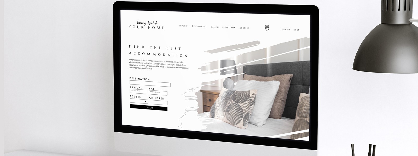
/
Online Ads
Web design in e-commerce is more than just aesthetics. It plays a pivotal role in creating a seamless user experience, building trust, and driving sales. A successful e-commerce website balances form and function, ensuring that users can easily navigate the site while being impressed by its visual appeal.
Here are some key reasons why web design is crucial for your e-commerce site:
First impressions matter: Your website is often the first interaction potential customers have with your brand. A professional, well-organized site creates a positive first impression and encourages visitors to explore further.
Usability and navigation: An intuitive layout makes it easy for customers to find products and information, reducing bounce rates and increasing the chances of a purchase.
Building trust: A clean, modern design with clear calls to action (CTAs) and secure payment options helps build trust with customers. Trust is essential in e-commerce, where users must feel confident in providing their payment information.
SEO benefits: Good web design can improve your site's search engine optimization (SEO), making it easier for customers to find your store through search engines. A well-optimized website ranks higher in search results, driving more organic traffic.

/
Design
Typography encompasses the style, arrangement, and presentation of text on a website. Beyond simply picking a font, it involves creating a clear visual hierarchy and flow that facilitates user interaction and enhances brand identity. Here's why typography is so vital:
Readability: Effective typography ensures that text remains legible on various devices, from desktop monitors to smartphones. Well-sized, readable fonts help users digest content more quickly and comfortably.
User Experience: Thoughtful typography improves the user experience by making it easier for visitors to navigate through content. Well-designed text can subtly guide users to critical sections or calls to action, making the browsing experience more intuitive.
Brand Identity: Typography communicates the essence of your brand. Fonts, sizes, and styles should reflect your brand's values and personality, whether that's professionalism, creativity, or playfulness.

/
Photography
Statistics show that high-quality product images are crucial for driving conversions and increasing sales. Let’s consider a few examples:
Etsy, which generated $818 million in revenue in 2019, knows the value of product photography. A survey revealed that 90% of Etsy buyers said that image quality was the most significant factor in their purchase decision, even more important than cost, shipping, or reviews.
A Czech retailer, Mall.CZ, was able to increase conversions by 9.46% on its category and product pages by simply making the product images larger. This minor tweak demonstrates the huge impact visual elements can have on a customer’s decision-making process.
In the UK, Golfsmith, an online store, reported a 10-30% increase in conversions when they implemented 360-degree product images. Giving customers the ability to view products from all angles helps them make more informed decisions, significantly reducing hesitation and increasing purchasing confidence.
The data speaks for itself: product imagery is a pivotal factor in e-commerce success. But why exactly does it matter so much? Let's dive into the details to better understand how professional photography boosts your brand awareness, drives conversions, and reduces return rates.

/
Photography
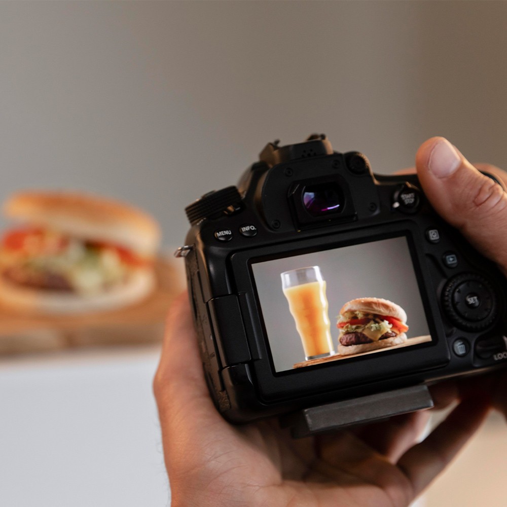
Got your mind racing for the best tips on ecommerce product photography in 2024? Welcome, brave entrepreneur! You’ve entered the battlefield of ecommerce promotion, where competition is fierce for the first page of Google. Fear not, because this guide has you covered.
Once you’re ready to dive into the strategies that separate amateurs from professionals, we’ll unveil the juiciest tips earned from years in the industry. No fluff, just insider secrets and actionable advice in this 9-minute read.
/
Photography
The role of product photography for an eCommerce store owner is as essential as wheels are to a car — it's a core element that ensures everything runs smoothly. High-quality imagery is a fundamental part of eCommerce, setting the bar for industry standards and consumer expectations. Product photography is not an optional extra; it's the driving force behind successful online retail.
This article is tailored for eCommerce enthusiasts who thrive on refining every detail, diving deep into the nuts and bolts of their operations to gain a competitive edge. We’ve dissected the types of product photography to guide both beginners and seasoned pros through the various styles, definitions, and usage examples. Whether these types are part of your daily strategy or reserved for niche purposes, learning to leverage them all will allow you to optimize your eCommerce store across all channels and communications.
By mastering these types of product photography, you'll be well-equipped to craft a versatile, appealing online presence that meets the high expectations of today’s customers.

/
Design
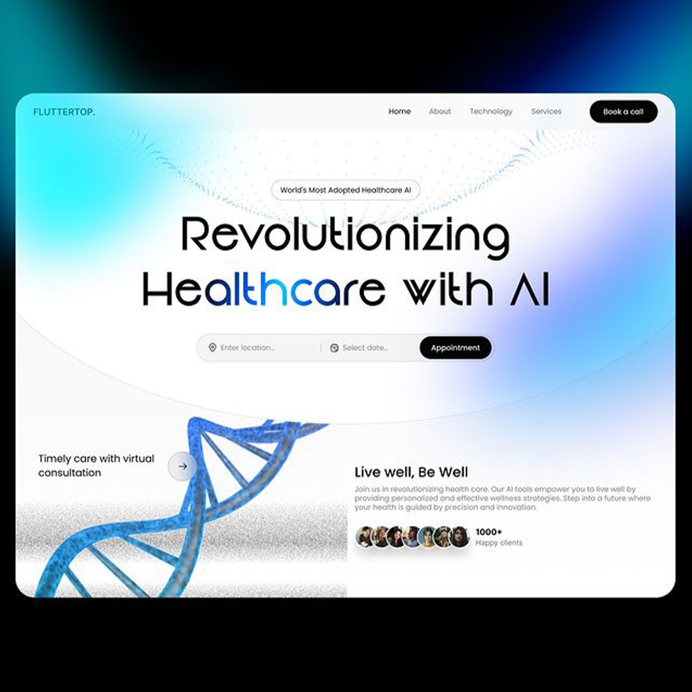
Framer offers several key advantages for building e-commerce stores, especially for businesses looking for a highly customized and unique shopping experience.
1.Exceptional customization and adaptability
Framer stands out for its ability to create highly tailored e-commerce stores. Unlike traditional e-commerce platforms, which often rely on pre-built templates, Framer allows for deep customization of every aspect of your online store. Here’s what you gain:
Craft a unique brand identity: Framer allows you to design a store that perfectly reflects your brand’s voice and aesthetics, helping you stand out from competitors.
Innovative features: You can go beyond basic e-commerce functionalities. For example, you can integrate interactive product visualizations, personalized shopping experiences, or even gamified elements to enhance customer engagement.
Tailored user journeys: Framer provides the flexibility to optimize your store’s user experience to meet specific customer needs, whether it’s a smoother product discovery process or an intuitive checkout.
2.User-Friendly design and intuitive interface
Framer is known for its ease of use, thanks to its drag-and-drop interface and minimal coding requirements. It’s an excellent platform for both designers and developers, providing:
Pre-built components and templates: Framer offers pre-designed elements like product cards and checkout forms, which can be customized to suit your needs.
Visually intuitive interface: Framer’s visual editor allows you to see your design come to life, enabling fast iteration and refinement.
Low-code environment: Although some customization may require coding, Framer allows users to create a lot without deep technical knowledge.
3.Flexibility and performance
Framer is well-suited for e-commerce stores that expect to scale as the business grows. Here’s why:
Component-based design: Framer’s reusable design elements simplify updates as your product offerings expand.
Headless CMS integration: Framer integrates seamlessly with headless CMS platforms like Contentful, enabling you to scale your content management without being tied to rigid templates.
Optimized performance: Framer’s use of modern web development practices ensures that your store remains fast and responsive, even as it grows, which can also help with SEO and user experience.
4.Integration with external tools and services
Framer supports a variety of integrations that enhance the functionality of your store. These include:
Payment gateways: Easily connect with platforms like Stripe or PayPal for secure transactions.
E-commerce platforms: Framer can integrate with Shopify or WooCommerce to manage product inventory, order fulfillment, and more.
Analytics and marketing tools: You can integrate your store with tools like Google Analytics for performance tracking or Mailchimp for marketing campaigns.
/
Design
In recent years, there has been a notable increase in the use of technology within the healthcare sector. From accelerating drug discovery to analyzing medical records for improved diagnosis, numerous instances highlight how technology has been a driving force behind the industry's growth. This leads us to an equally important concept: Healthcare UX.
Picture this: a hospital with clear signage that's easy to follow or a medication label with straightforward instructions. These are prime examples of effective UX design in healthcare, making processes smoother and more accessible for patients and professionals alike.
/
Online Ads
Google ads
Google Ads is Google’s online advertising platform that enables businesses to create and display ads aimed at potential customers who are actively searching for specific products or services. This platform helps businesses reach a highly targeted audience through various ad formats and campaign types, optimizing their visibility and engagement.
Pros:
Promotion and Visibility: Google Ads enhances your business's online presence, promoting products or services, boosting brand awareness, and driving traffic to your website. As the most popular search engine, Google enables businesses to reach a high-intent audience actively searching for relevant offerings.
Flexible Campaign Management: You have full control over your campaigns, with the ability to adjust ad text, settings, and budgets at any time to align with your marketing goals. You can also track and monitor ad performance in real-time.
Budget-Friendly Advertising: Google Ads allows you to set and control your budget with no minimum spending requirement. You can choose where your ads appear and easily measure their effectiveness, ensuring cost-efficient advertising.
Cons:
Cost: Competitive keywords can be costly, posing a challenge for smaller businesses with limited budgets.
Complexity: Managing Google Ads campaigns can be difficult for beginners due to the platform's complexity and the need for optimization skills.
Facebook ads
Facebook Ads are displayed across the Facebook platform, granting access to over 2 billion monthly users. The platform is beginner-friendly, meaning you don’t need extensive expertise to advertise. You can create and manage campaigns using intuitive tools and track performance with clear, detailed reports. Facebook Ads provide access to diverse audiences, making it a valuable tool for businesses of all sizes and types.
Pros:
Cross-Device Visibility: Facebook Ads automatically optimize your ads to appear on the devices your audience prefers, whether it’s mobile phones or desktops, ensuring maximum reach.
Universal Engagement: Facebook makes it easy to advertise across different platforms. By using Advantage+ placements, your ads run in the spaces most likely to achieve your marketing goals.
Effortless Management: Facebook offers advertiser controls, allowing you to manage where and how your ads appear. With user-friendly brand controls, you can set parameters and maintain full control over your campaigns.
Engaging Video Ads: Facebook provides a variety of video ad options and placements, helping you connect with your audience through visually engaging content that aligns with their online habits.
Cons:
Ad Competition: The high volume of businesses advertising on Facebook leads to intense competition for ad space, which can drive up costs, especially for popular audience segments.
Ad Fatigue: Frequent exposure to the same ads may result in the audience losing interest, reducing engagement and overall ad effectiveness over time.
Organic Reach Decline: Changes to Facebook's algorithms have decreased organic reach for business pages, making it harder for businesses to connect with their audience without investing in paid ads.
/
Online Ads
Google Ads, formerly known as Google AdWords, is Google’s digital advertising platform. It offers various ad formats, including text, images, and videos, that appear on Google search results and across the Google Ads Network. This network helps businesses reach people searching for relevant products or services. Google Ads can increase website traffic, generate more business inquiries, and drive purchases.
/
Design
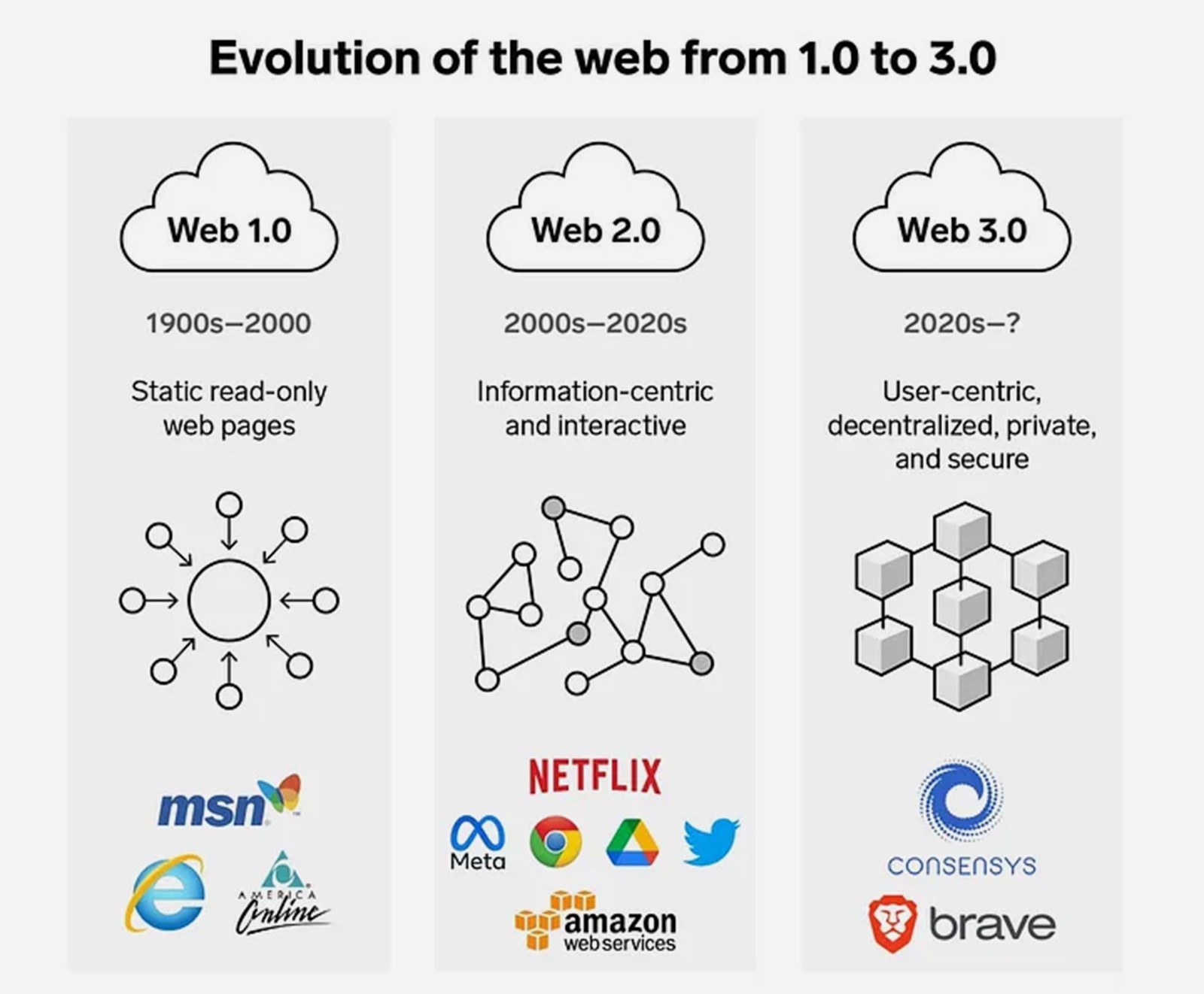
Web1, the internet's first iteration, emerged in the late 1980s and lasted until the early 2000s. It was often called the "read-only" web due to its static HTML pages and limited user interaction. During this period, websites were typically owned by companies, and there was little user-generated content.
Web2, which began gaining traction around 2004 and continues to be the dominant web model today, is known as the "read-write" web. It introduced more interactive features such as user-generated content, social media platforms, and cloud services, fostering greater engagement and social connections. Major tech companies like Google, Facebook, and Amazon flourished during this era, centralizing much of the internet's data and services.

/
Branding
A cloud kitchen, also referred to as a ghost kitchen or dark kitchen, is a commercial kitchen space designed exclusively for food delivery. Unlike traditional restaurants, cloud kitchens do not have a physical dining area, focusing solely on preparing meals for delivery through online ordering platforms.
Here’s what sets cloud kitchens apart:
No Dine-In Option: Cloud kitchens lack a front-of-house area for customers. All orders are placed online and delivered directly to the customer’s location.
Multiple Brands: Often, a single cloud kitchen operates several different food brands or cuisines from the same kitchen, allowing for flexibility in catering to diverse customer preferences.
Technology-Driven: These kitchens rely heavily on technology, using delivery apps like UberEATS, Grubhub, and DoorDash to reach customers. Data analytics play a key role in tracking popular dishes, order timings, and customer behavior.
Cost Efficiency: Without the need for a dining area, cloud kitchens save on overhead costs that traditional restaurants bear, allowing them to focus on efficient food preparation and delivery services.
Flexibility and Scalability: Cloud kitchens can quickly adjust to shifts in consumer demand and trends, and can easily scale their operations based on business growth or market conditions.
/
Design
Diving into the world of Webflow can be both thrilling and overwhelming for beginners. Fortunately, there are apps designed to ease this transition.

These tools not only improve the user experience but also offer essential features to accelerate the web design process.
Here are three must-have apps for beginners:
Figma to webflow integration
Figma to Webflow Integration provides:
Effortless syncing of Figma designs to Webflow projects
A solution to bridge the gap between design and development
The ability to convert your designs into Webflow code
This is a game changer for beginners, allowing them to bring their designs to life in Webflow.
It streamlines the workflow, enabling new designers to transform their creations into functional websites without the need for coding skills.
Unsplash integration

Unsplash Integration is another essential tool for beginners. It allows you to effortlessly add high-quality images to your Webflow projects. With access to an extensive library of photos suitable for any purpose, including commercial use, this app helps elevate the visual appeal of your site.
Its ease of use and flexibility make it an ideal choice for new Webflow users looking to design stunning websites. To further enhance performance, consider using platforms like TinyPNG to compress and optimize image files, which can improve loading times and boost SEO.
/
Online Ads
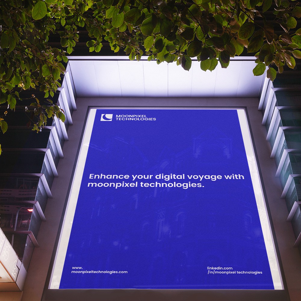
A banner ad is a type of online advertisement that appears as a graphic display on websites, aimed at attracting the attention of visitors and encouraging them to click through to the advertiser's website or landing page.
Banner ads come in a variety of sizes and formats, ranging from static images to animated graphics. Vertical banner ads are typically referred to as "skyscrapers," while horizontal ones are called "leaderboards."
These ads are often used to promote products, services, events, or to increase brand awareness. The effectiveness of a banner ad depends on factors such as its design, placement, and relevance to the target audience.
/
Business
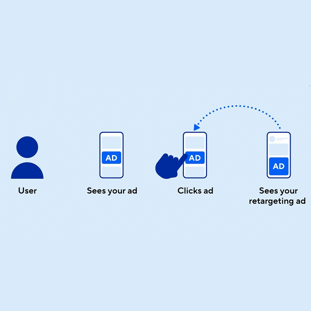
Ad retargeting is a form of online advertising that enables businesses to re-engage potential customers who left their website without completing a purchase. By targeting users who have already shown interest in their products or services, businesses can increase brand visibility and remind these customers of what they were browsing. This strategy helps businesses stay top-of-mind as potential buyers navigate other websites, encouraging them to return and complete their transaction.
Benefits of ad retargeting
Ad retargeting aims to re-engage potential buyers who have shown interest in your products or services, encouraging them to return and complete a purchase. As a vital part of the sales funnel, it can be utilized at any stage of the buyer's journey. Some key benefits include:
Expanded brand awareness
Shortening the sales funnel process
Improving advertising performance
Increased sales
Better audience understanding
Higher ROI (return on investment)
Retaining existing customers

/
Branding
The main goal of marketing your brand is to build customer loyalty, encourage customer referrals, increase brand recognition, and ultimately allow your business to charge premium prices for products. This is a long-term goal that many businesses overlook, focusing instead on short term sales.
Brand marketing goes beyond just promoting products or services—it’s about creating a brand identity that customers can connect with on an emotional level. By marketing your brand as part of a larger concept or lifestyle, you tap into the emotional side of consumer behavior. Humans are more likely to buy from brands that evoke strong feelings or align with their values. A successful brand doesn’t just sell a product; it sells an experience, a belief, or a way of life.

/
Online Ads
In May, SEO expert Rand Fishkin revealed that a source had obtained Google’s Search Division API documentation via GitHub. Google confirmed the legitimacy of these documents, which largely support long-held suspicions about the search engine’s algorithm.
The leak underscores the importance of:
Link building
Site authoritya
Navboost (Google’s tracking of user engagement to rank content)
Chrome data in the search experience
Quality content and user experience
Despite the leak, Google advises against jumping to conclusions. Stick to standard SEO best practices and focus on E-E-A-T (Experience, Expertise, Authoritativeness, Trustworthiness) to enhance your rankings.
According to Neil Patel, Rand Fishkin emphasis on building a recognizable brand outside of Google is key to increasing organic traffic is a trend to adopt.
Topics
ALL TOPICS
BRANDING
BUSINESS
DESIGN
DEVELOPMENT
HR
RESEARCH

/
Online Ads
Advertising is a strategic approach that uses paid messaging across different media platforms to shape consumer perceptions and drive actions. Its primary goal is to inform, persuade, and influence purchasing behaviors or enhance brand recognition by targeting specific audiences. Through this effort, businesses aim to engage consumers and ultimately increase sales or awareness.

/
Design
Web design psychology is a multidisciplinary field that combines elements of psychology, user experience (UX) design, and visual design to understand how users interact with websites and how to make informed design decisions. By understanding user behavior, cognitive processes, emotions, and motivations, designers can create websites that are intuitive, engaging, and effective. In this section, we’ll explore the concept of web design psychology, its importance in today’s digital landscape, and its evolution over time.
What is web design psychology?
Web design psychology focuses on how users perceive, process, and react to various elements of web design. It involves studying user behavior and mental processes to create web designs that are easy to navigate, aesthetically pleasing, and aligned with user expectations. By incorporating psychological principles into web design, designers can influence how users experience a website, increasing satisfaction and driving actions such as purchases, subscriptions, or social shares.
The discipline covers several aspects of user interaction, including:
Cognitive Load: Reducing the mental effort required to use the website.
Visual Hierarchy: Directing user attention to the most important content first.
Emotional Engagement: Creating positive emotional responses that build trust and brand loyalty.
Evolution of web design psychology
The evolution of web design psychology has been shaped by technological advancements and the changing needs of users. In its early stages, web design was primarily concerned with aesthetics and functionality—ensuring websites were visually appealing and operational. However, as user behavior research expanded, it became evident that understanding how and why users interact with websites could lead to more effective designs.
Over time, web design psychology became a central part of UX design, integrating knowledge from fields such as:
Cognitive Psychology: Understanding how people think, learn, and remember.
Behavioral Psychology: Studying how users are influenced by stimuli and how they make decisions.
Sociology and Anthropology: Considering cultural and societal influences on user behavior.
With the rise of user-centered design and data-driven decision-making, the importance of web design psychology has grown. Today, designers use empirical research, user testing, and data analysis to build websites that align with user expectations, making it a core component of UX design.
As we continue, we’ll explore the key principles of web design psychology, such as visual hierarchy, cognitive load, and emotional engagement. These principles are crucial in shaping user experiences and will be illustrated through practical strategies, real-life examples, and case studies that show successful implementation. Let’s dive in and uncover the secrets of web design psychology!

/
Online Ads
Web design in e-commerce is more than just aesthetics. It plays a pivotal role in creating a seamless user experience, building trust, and driving sales. A successful e-commerce website balances form and function, ensuring that users can easily navigate the site while being impressed by its visual appeal.
Here are some key reasons why web design is crucial for your e-commerce site:
First impressions matter: Your website is often the first interaction potential customers have with your brand. A professional, well-organized site creates a positive first impression and encourages visitors to explore further.
Usability and navigation: An intuitive layout makes it easy for customers to find products and information, reducing bounce rates and increasing the chances of a purchase.
Building trust: A clean, modern design with clear calls to action (CTAs) and secure payment options helps build trust with customers. Trust is essential in e-commerce, where users must feel confident in providing their payment information.
SEO benefits: Good web design can improve your site's search engine optimization (SEO), making it easier for customers to find your store through search engines. A well-optimized website ranks higher in search results, driving more organic traffic.

/
Design
Typography encompasses the style, arrangement, and presentation of text on a website. Beyond simply picking a font, it involves creating a clear visual hierarchy and flow that facilitates user interaction and enhances brand identity. Here's why typography is so vital:
Readability: Effective typography ensures that text remains legible on various devices, from desktop monitors to smartphones. Well-sized, readable fonts help users digest content more quickly and comfortably.
User Experience: Thoughtful typography improves the user experience by making it easier for visitors to navigate through content. Well-designed text can subtly guide users to critical sections or calls to action, making the browsing experience more intuitive.
Brand Identity: Typography communicates the essence of your brand. Fonts, sizes, and styles should reflect your brand's values and personality, whether that's professionalism, creativity, or playfulness.

/
Photography
Statistics show that high-quality product images are crucial for driving conversions and increasing sales. Let’s consider a few examples:
Etsy, which generated $818 million in revenue in 2019, knows the value of product photography. A survey revealed that 90% of Etsy buyers said that image quality was the most significant factor in their purchase decision, even more important than cost, shipping, or reviews.
A Czech retailer, Mall.CZ, was able to increase conversions by 9.46% on its category and product pages by simply making the product images larger. This minor tweak demonstrates the huge impact visual elements can have on a customer’s decision-making process.
In the UK, Golfsmith, an online store, reported a 10-30% increase in conversions when they implemented 360-degree product images. Giving customers the ability to view products from all angles helps them make more informed decisions, significantly reducing hesitation and increasing purchasing confidence.
The data speaks for itself: product imagery is a pivotal factor in e-commerce success. But why exactly does it matter so much? Let's dive into the details to better understand how professional photography boosts your brand awareness, drives conversions, and reduces return rates.

/
Photography
Got your mind racing for the best tips on ecommerce product photography in 2024? Welcome, brave entrepreneur! You’ve entered the battlefield of ecommerce promotion, where competition is fierce for the first page of Google. Fear not, because this guide has you covered.
Once you’re ready to dive into the strategies that separate amateurs from professionals, we’ll unveil the juiciest tips earned from years in the industry. No fluff, just insider secrets and actionable advice in this 9-minute read.

/
Photography
The role of product photography for an eCommerce store owner is as essential as wheels are to a car — it's a core element that ensures everything runs smoothly. High-quality imagery is a fundamental part of eCommerce, setting the bar for industry standards and consumer expectations. Product photography is not an optional extra; it's the driving force behind successful online retail.
This article is tailored for eCommerce enthusiasts who thrive on refining every detail, diving deep into the nuts and bolts of their operations to gain a competitive edge. We’ve dissected the types of product photography to guide both beginners and seasoned pros through the various styles, definitions, and usage examples. Whether these types are part of your daily strategy or reserved for niche purposes, learning to leverage them all will allow you to optimize your eCommerce store across all channels and communications.
By mastering these types of product photography, you'll be well-equipped to craft a versatile, appealing online presence that meets the high expectations of today’s customers.

/
Design
Framer offers several key advantages for building e-commerce stores, especially for businesses looking for a highly customized and unique shopping experience.
1.Exceptional customization and adaptability
Framer stands out for its ability to create highly tailored e-commerce stores. Unlike traditional e-commerce platforms, which often rely on pre-built templates, Framer allows for deep customization of every aspect of your online store. Here’s what you gain:
Craft a unique brand identity: Framer allows you to design a store that perfectly reflects your brand’s voice and aesthetics, helping you stand out from competitors.
Innovative features: You can go beyond basic e-commerce functionalities. For example, you can integrate interactive product visualizations, personalized shopping experiences, or even gamified elements to enhance customer engagement.
Tailored user journeys: Framer provides the flexibility to optimize your store’s user experience to meet specific customer needs, whether it’s a smoother product discovery process or an intuitive checkout.
2.User-Friendly design and intuitive interface
Framer is known for its ease of use, thanks to its drag-and-drop interface and minimal coding requirements. It’s an excellent platform for both designers and developers, providing:
Pre-built components and templates: Framer offers pre-designed elements like product cards and checkout forms, which can be customized to suit your needs.
Visually intuitive interface: Framer’s visual editor allows you to see your design come to life, enabling fast iteration and refinement.
Low-code environment: Although some customization may require coding, Framer allows users to create a lot without deep technical knowledge.
3.Flexibility and performance
Framer is well-suited for e-commerce stores that expect to scale as the business grows. Here’s why:
Component-based design: Framer’s reusable design elements simplify updates as your product offerings expand.
Headless CMS integration: Framer integrates seamlessly with headless CMS platforms like Contentful, enabling you to scale your content management without being tied to rigid templates.
Optimized performance: Framer’s use of modern web development practices ensures that your store remains fast and responsive, even as it grows, which can also help with SEO and user experience.
4.Integration with external tools and services
Framer supports a variety of integrations that enhance the functionality of your store. These include:
Payment gateways: Easily connect with platforms like Stripe or PayPal for secure transactions.
E-commerce platforms: Framer can integrate with Shopify or WooCommerce to manage product inventory, order fulfillment, and more.
Analytics and marketing tools: You can integrate your store with tools like Google Analytics for performance tracking or Mailchimp for marketing campaigns.

/
Design
In recent years, there has been a notable increase in the use of technology within the healthcare sector. From accelerating drug discovery to analyzing medical records for improved diagnosis, numerous instances highlight how technology has been a driving force behind the industry's growth. This leads us to an equally important concept: Healthcare UX.
Picture this: a hospital with clear signage that's easy to follow or a medication label with straightforward instructions. These are prime examples of effective UX design in healthcare, making processes smoother and more accessible for patients and professionals alike.

/
Online Ads
Google ads
Google Ads is Google’s online advertising platform that enables businesses to create and display ads aimed at potential customers who are actively searching for specific products or services. This platform helps businesses reach a highly targeted audience through various ad formats and campaign types, optimizing their visibility and engagement.
Pros:
Promotion and Visibility: Google Ads enhances your business's online presence, promoting products or services, boosting brand awareness, and driving traffic to your website. As the most popular search engine, Google enables businesses to reach a high-intent audience actively searching for relevant offerings.
Flexible Campaign Management: You have full control over your campaigns, with the ability to adjust ad text, settings, and budgets at any time to align with your marketing goals. You can also track and monitor ad performance in real-time.
Budget-Friendly Advertising: Google Ads allows you to set and control your budget with no minimum spending requirement. You can choose where your ads appear and easily measure their effectiveness, ensuring cost-efficient advertising.
Cons:
Cost: Competitive keywords can be costly, posing a challenge for smaller businesses with limited budgets.
Complexity: Managing Google Ads campaigns can be difficult for beginners due to the platform's complexity and the need for optimization skills.
Facebook ads
Facebook Ads are displayed across the Facebook platform, granting access to over 2 billion monthly users. The platform is beginner-friendly, meaning you don’t need extensive expertise to advertise. You can create and manage campaigns using intuitive tools and track performance with clear, detailed reports. Facebook Ads provide access to diverse audiences, making it a valuable tool for businesses of all sizes and types.
Pros:
Cross-Device Visibility: Facebook Ads automatically optimize your ads to appear on the devices your audience prefers, whether it’s mobile phones or desktops, ensuring maximum reach.
Universal Engagement: Facebook makes it easy to advertise across different platforms. By using Advantage+ placements, your ads run in the spaces most likely to achieve your marketing goals.
Effortless Management: Facebook offers advertiser controls, allowing you to manage where and how your ads appear. With user-friendly brand controls, you can set parameters and maintain full control over your campaigns.
Engaging Video Ads: Facebook provides a variety of video ad options and placements, helping you connect with your audience through visually engaging content that aligns with their online habits.
Cons:
Ad Competition: The high volume of businesses advertising on Facebook leads to intense competition for ad space, which can drive up costs, especially for popular audience segments.
Ad Fatigue: Frequent exposure to the same ads may result in the audience losing interest, reducing engagement and overall ad effectiveness over time.
Organic Reach Decline: Changes to Facebook's algorithms have decreased organic reach for business pages, making it harder for businesses to connect with their audience without investing in paid ads.

/
Online Ads
Google Ads, formerly known as Google AdWords, is Google’s digital advertising platform. It offers various ad formats, including text, images, and videos, that appear on Google search results and across the Google Ads Network. This network helps businesses reach people searching for relevant products or services. Google Ads can increase website traffic, generate more business inquiries, and drive purchases.

/
Design
Web1, the internet's first iteration, emerged in the late 1980s and lasted until the early 2000s. It was often called the "read-only" web due to its static HTML pages and limited user interaction. During this period, websites were typically owned by companies, and there was little user-generated content.
Web2, which began gaining traction around 2004 and continues to be the dominant web model today, is known as the "read-write" web. It introduced more interactive features such as user-generated content, social media platforms, and cloud services, fostering greater engagement and social connections. Major tech companies like Google, Facebook, and Amazon flourished during this era, centralizing much of the internet's data and services.


/
Branding
A cloud kitchen, also referred to as a ghost kitchen or dark kitchen, is a commercial kitchen space designed exclusively for food delivery. Unlike traditional restaurants, cloud kitchens do not have a physical dining area, focusing solely on preparing meals for delivery through online ordering platforms.
Here’s what sets cloud kitchens apart:
No Dine-In Option: Cloud kitchens lack a front-of-house area for customers. All orders are placed online and delivered directly to the customer’s location.
Multiple Brands: Often, a single cloud kitchen operates several different food brands or cuisines from the same kitchen, allowing for flexibility in catering to diverse customer preferences.
Technology-Driven: These kitchens rely heavily on technology, using delivery apps like UberEATS, Grubhub, and DoorDash to reach customers. Data analytics play a key role in tracking popular dishes, order timings, and customer behavior.
Cost Efficiency: Without the need for a dining area, cloud kitchens save on overhead costs that traditional restaurants bear, allowing them to focus on efficient food preparation and delivery services.
Flexibility and Scalability: Cloud kitchens can quickly adjust to shifts in consumer demand and trends, and can easily scale their operations based on business growth or market conditions.

/
Design
Diving into the world of Webflow can be both thrilling and overwhelming for beginners. Fortunately, there are apps designed to ease this transition.

These tools not only improve the user experience but also offer essential features to accelerate the web design process.
Here are three must-have apps for beginners:
Figma to webflow integration

Figma to Webflow Integration provides:
Effortless syncing of Figma designs to Webflow projects
A solution to bridge the gap between design and development
The ability to convert your designs into Webflow code
This is a game changer for beginners, allowing them to bring their designs to life in Webflow.
It streamlines the workflow, enabling new designers to transform their creations into functional websites without the need for coding skills.
Unsplash integration

Unsplash Integration is another essential tool for beginners. It allows you to effortlessly add high-quality images to your Webflow projects. With access to an extensive library of photos suitable for any purpose, including commercial use, this app helps elevate the visual appeal of your site.
Its ease of use and flexibility make it an ideal choice for new Webflow users looking to design stunning websites. To further enhance performance, consider using platforms like TinyPNG to compress and optimize image files, which can improve loading times and boost SEO.

/
Online Ads
A banner ad is a type of online advertisement that appears as a graphic display on websites, aimed at attracting the attention of visitors and encouraging them to click through to the advertiser's website or landing page.
Banner ads come in a variety of sizes and formats, ranging from static images to animated graphics. Vertical banner ads are typically referred to as "skyscrapers," while horizontal ones are called "leaderboards."
These ads are often used to promote products, services, events, or to increase brand awareness. The effectiveness of a banner ad depends on factors such as its design, placement, and relevance to the target audience.

/
Business
Ad retargeting is a form of online advertising that enables businesses to re-engage potential customers who left their website without completing a purchase. By targeting users who have already shown interest in their products or services, businesses can increase brand visibility and remind these customers of what they were browsing. This strategy helps businesses stay top-of-mind as potential buyers navigate other websites, encouraging them to return and complete their transaction.
Benefits of ad retargeting
Ad retargeting aims to re-engage potential buyers who have shown interest in your products or services, encouraging them to return and complete a purchase. As a vital part of the sales funnel, it can be utilized at any stage of the buyer's journey. Some key benefits include:
Expanded brand awareness
Shortening the sales funnel process
Improving advertising performance
Increased sales
Better audience understanding
Higher ROI (return on investment)
Retaining existing customers

/
Branding
The main goal of marketing your brand is to build customer loyalty, encourage customer referrals, increase brand recognition, and ultimately allow your business to charge premium prices for products. This is a long-term goal that many businesses overlook, focusing instead on short term sales.
Brand marketing goes beyond just promoting products or services—it’s about creating a brand identity that customers can connect with on an emotional level. By marketing your brand as part of a larger concept or lifestyle, you tap into the emotional side of consumer behavior. Humans are more likely to buy from brands that evoke strong feelings or align with their values. A successful brand doesn’t just sell a product; it sells an experience, a belief, or a way of life.

/
Online Ads
In May, SEO expert Rand Fishkin revealed that a source had obtained Google’s Search Division API documentation via GitHub. Google confirmed the legitimacy of these documents, which largely support long-held suspicions about the search engine’s algorithm.
The leak underscores the importance of:
Link building
Site authoritya
Navboost (Google’s tracking of user engagement to rank content)
Chrome data in the search experience
Quality content and user experience
Despite the leak, Google advises against jumping to conclusions. Stick to standard SEO best practices and focus on E-E-A-T (Experience, Expertise, Authoritativeness, Trustworthiness) to enhance your rankings.
According to Neil Patel, Rand Fishkin emphasis on building a recognizable brand outside of Google is key to increasing organic traffic is a trend to adopt.
Topics
ALL TOPICS
BRANDING
BUSINESS
DESIGN
DEVELOPMENT
HR
RESEARCH

/
Online Ads
Advertising is a strategic approach that uses paid messaging across different media platforms to shape consumer perceptions and drive actions. Its primary goal is to inform, persuade, and influence purchasing behaviors or enhance brand recognition by targeting specific audiences. Through this effort, businesses aim to engage consumers and ultimately increase sales or awareness.

/
Design
Web design psychology is a multidisciplinary field that combines elements of psychology, user experience (UX) design, and visual design to understand how users interact with websites and how to make informed design decisions. By understanding user behavior, cognitive processes, emotions, and motivations, designers can create websites that are intuitive, engaging, and effective. In this section, we’ll explore the concept of web design psychology, its importance in today’s digital landscape, and its evolution over time.
What is web design psychology?
Web design psychology focuses on how users perceive, process, and react to various elements of web design. It involves studying user behavior and mental processes to create web designs that are easy to navigate, aesthetically pleasing, and aligned with user expectations. By incorporating psychological principles into web design, designers can influence how users experience a website, increasing satisfaction and driving actions such as purchases, subscriptions, or social shares.
The discipline covers several aspects of user interaction, including:
Cognitive Load: Reducing the mental effort required to use the website.
Visual Hierarchy: Directing user attention to the most important content first.
Emotional Engagement: Creating positive emotional responses that build trust and brand loyalty.
Evolution of web design psychology
The evolution of web design psychology has been shaped by technological advancements and the changing needs of users. In its early stages, web design was primarily concerned with aesthetics and functionality—ensuring websites were visually appealing and operational. However, as user behavior research expanded, it became evident that understanding how and why users interact with websites could lead to more effective designs.
Over time, web design psychology became a central part of UX design, integrating knowledge from fields such as:
Cognitive Psychology: Understanding how people think, learn, and remember.
Behavioral Psychology: Studying how users are influenced by stimuli and how they make decisions.
Sociology and Anthropology: Considering cultural and societal influences on user behavior.
With the rise of user-centered design and data-driven decision-making, the importance of web design psychology has grown. Today, designers use empirical research, user testing, and data analysis to build websites that align with user expectations, making it a core component of UX design.
As we continue, we’ll explore the key principles of web design psychology, such as visual hierarchy, cognitive load, and emotional engagement. These principles are crucial in shaping user experiences and will be illustrated through practical strategies, real-life examples, and case studies that show successful implementation. Let’s dive in and uncover the secrets of web design psychology!

/
Online Ads
Web design in e-commerce is more than just aesthetics. It plays a pivotal role in creating a seamless user experience, building trust, and driving sales. A successful e-commerce website balances form and function, ensuring that users can easily navigate the site while being impressed by its visual appeal.
Here are some key reasons why web design is crucial for your e-commerce site:
First impressions matter: Your website is often the first interaction potential customers have with your brand. A professional, well-organized site creates a positive first impression and encourages visitors to explore further.
Usability and navigation: An intuitive layout makes it easy for customers to find products and information, reducing bounce rates and increasing the chances of a purchase.
Building trust: A clean, modern design with clear calls to action (CTAs) and secure payment options helps build trust with customers. Trust is essential in e-commerce, where users must feel confident in providing their payment information.
SEO benefits: Good web design can improve your site's search engine optimization (SEO), making it easier for customers to find your store through search engines. A well-optimized website ranks higher in search results, driving more organic traffic.

/
Design
Typography encompasses the style, arrangement, and presentation of text on a website. Beyond simply picking a font, it involves creating a clear visual hierarchy and flow that facilitates user interaction and enhances brand identity. Here's why typography is so vital:
Readability: Effective typography ensures that text remains legible on various devices, from desktop monitors to smartphones. Well-sized, readable fonts help users digest content more quickly and comfortably.
User Experience: Thoughtful typography improves the user experience by making it easier for visitors to navigate through content. Well-designed text can subtly guide users to critical sections or calls to action, making the browsing experience more intuitive.
Brand Identity: Typography communicates the essence of your brand. Fonts, sizes, and styles should reflect your brand's values and personality, whether that's professionalism, creativity, or playfulness.

/
Photography
Statistics show that high-quality product images are crucial for driving conversions and increasing sales. Let’s consider a few examples:
Etsy, which generated $818 million in revenue in 2019, knows the value of product photography. A survey revealed that 90% of Etsy buyers said that image quality was the most significant factor in their purchase decision, even more important than cost, shipping, or reviews.
A Czech retailer, Mall.CZ, was able to increase conversions by 9.46% on its category and product pages by simply making the product images larger. This minor tweak demonstrates the huge impact visual elements can have on a customer’s decision-making process.
In the UK, Golfsmith, an online store, reported a 10-30% increase in conversions when they implemented 360-degree product images. Giving customers the ability to view products from all angles helps them make more informed decisions, significantly reducing hesitation and increasing purchasing confidence.
The data speaks for itself: product imagery is a pivotal factor in e-commerce success. But why exactly does it matter so much? Let's dive into the details to better understand how professional photography boosts your brand awareness, drives conversions, and reduces return rates.

/
Photography
Got your mind racing for the best tips on ecommerce product photography in 2024? Welcome, brave entrepreneur! You’ve entered the battlefield of ecommerce promotion, where competition is fierce for the first page of Google. Fear not, because this guide has you covered.
Once you’re ready to dive into the strategies that separate amateurs from professionals, we’ll unveil the juiciest tips earned from years in the industry. No fluff, just insider secrets and actionable advice in this 9-minute read.

/
Photography
The role of product photography for an eCommerce store owner is as essential as wheels are to a car — it's a core element that ensures everything runs smoothly. High-quality imagery is a fundamental part of eCommerce, setting the bar for industry standards and consumer expectations. Product photography is not an optional extra; it's the driving force behind successful online retail.
This article is tailored for eCommerce enthusiasts who thrive on refining every detail, diving deep into the nuts and bolts of their operations to gain a competitive edge. We’ve dissected the types of product photography to guide both beginners and seasoned pros through the various styles, definitions, and usage examples. Whether these types are part of your daily strategy or reserved for niche purposes, learning to leverage them all will allow you to optimize your eCommerce store across all channels and communications.
By mastering these types of product photography, you'll be well-equipped to craft a versatile, appealing online presence that meets the high expectations of today’s customers.

/
Design
Framer offers several key advantages for building e-commerce stores, especially for businesses looking for a highly customized and unique shopping experience.
1.Exceptional customization and adaptability
Framer stands out for its ability to create highly tailored e-commerce stores. Unlike traditional e-commerce platforms, which often rely on pre-built templates, Framer allows for deep customization of every aspect of your online store. Here’s what you gain:
Craft a unique brand identity: Framer allows you to design a store that perfectly reflects your brand’s voice and aesthetics, helping you stand out from competitors.
Innovative features: You can go beyond basic e-commerce functionalities. For example, you can integrate interactive product visualizations, personalized shopping experiences, or even gamified elements to enhance customer engagement.
Tailored user journeys: Framer provides the flexibility to optimize your store’s user experience to meet specific customer needs, whether it’s a smoother product discovery process or an intuitive checkout.
2.User-Friendly design and intuitive interface
Framer is known for its ease of use, thanks to its drag-and-drop interface and minimal coding requirements. It’s an excellent platform for both designers and developers, providing:
Pre-built components and templates: Framer offers pre-designed elements like product cards and checkout forms, which can be customized to suit your needs.
Visually intuitive interface: Framer’s visual editor allows you to see your design come to life, enabling fast iteration and refinement.
Low-code environment: Although some customization may require coding, Framer allows users to create a lot without deep technical knowledge.
3.Flexibility and performance
Framer is well-suited for e-commerce stores that expect to scale as the business grows. Here’s why:
Component-based design: Framer’s reusable design elements simplify updates as your product offerings expand.
Headless CMS integration: Framer integrates seamlessly with headless CMS platforms like Contentful, enabling you to scale your content management without being tied to rigid templates.
Optimized performance: Framer’s use of modern web development practices ensures that your store remains fast and responsive, even as it grows, which can also help with SEO and user experience.
4.Integration with external tools and services
Framer supports a variety of integrations that enhance the functionality of your store. These include:
Payment gateways: Easily connect with platforms like Stripe or PayPal for secure transactions.
E-commerce platforms: Framer can integrate with Shopify or WooCommerce to manage product inventory, order fulfillment, and more.
Analytics and marketing tools: You can integrate your store with tools like Google Analytics for performance tracking or Mailchimp for marketing campaigns.

/
Design
In recent years, there has been a notable increase in the use of technology within the healthcare sector. From accelerating drug discovery to analyzing medical records for improved diagnosis, numerous instances highlight how technology has been a driving force behind the industry's growth. This leads us to an equally important concept: Healthcare UX.
Picture this: a hospital with clear signage that's easy to follow or a medication label with straightforward instructions. These are prime examples of effective UX design in healthcare, making processes smoother and more accessible for patients and professionals alike.

/
Online Ads
Google ads
Google Ads is Google’s online advertising platform that enables businesses to create and display ads aimed at potential customers who are actively searching for specific products or services. This platform helps businesses reach a highly targeted audience through various ad formats and campaign types, optimizing their visibility and engagement.
Pros:
Promotion and Visibility: Google Ads enhances your business's online presence, promoting products or services, boosting brand awareness, and driving traffic to your website. As the most popular search engine, Google enables businesses to reach a high-intent audience actively searching for relevant offerings.
Flexible Campaign Management: You have full control over your campaigns, with the ability to adjust ad text, settings, and budgets at any time to align with your marketing goals. You can also track and monitor ad performance in real-time.
Budget-Friendly Advertising: Google Ads allows you to set and control your budget with no minimum spending requirement. You can choose where your ads appear and easily measure their effectiveness, ensuring cost-efficient advertising.
Cons:
Cost: Competitive keywords can be costly, posing a challenge for smaller businesses with limited budgets.
Complexity: Managing Google Ads campaigns can be difficult for beginners due to the platform's complexity and the need for optimization skills.
Facebook ads
Facebook Ads are displayed across the Facebook platform, granting access to over 2 billion monthly users. The platform is beginner-friendly, meaning you don’t need extensive expertise to advertise. You can create and manage campaigns using intuitive tools and track performance with clear, detailed reports. Facebook Ads provide access to diverse audiences, making it a valuable tool for businesses of all sizes and types.
Pros:
Cross-Device Visibility: Facebook Ads automatically optimize your ads to appear on the devices your audience prefers, whether it’s mobile phones or desktops, ensuring maximum reach.
Universal Engagement: Facebook makes it easy to advertise across different platforms. By using Advantage+ placements, your ads run in the spaces most likely to achieve your marketing goals.
Effortless Management: Facebook offers advertiser controls, allowing you to manage where and how your ads appear. With user-friendly brand controls, you can set parameters and maintain full control over your campaigns.
Engaging Video Ads: Facebook provides a variety of video ad options and placements, helping you connect with your audience through visually engaging content that aligns with their online habits.
Cons:
Ad Competition: The high volume of businesses advertising on Facebook leads to intense competition for ad space, which can drive up costs, especially for popular audience segments.
Ad Fatigue: Frequent exposure to the same ads may result in the audience losing interest, reducing engagement and overall ad effectiveness over time.
Organic Reach Decline: Changes to Facebook's algorithms have decreased organic reach for business pages, making it harder for businesses to connect with their audience without investing in paid ads.

/
Online Ads
Google Ads, formerly known as Google AdWords, is Google’s digital advertising platform. It offers various ad formats, including text, images, and videos, that appear on Google search results and across the Google Ads Network. This network helps businesses reach people searching for relevant products or services. Google Ads can increase website traffic, generate more business inquiries, and drive purchases.

/
Design
Web1, the internet's first iteration, emerged in the late 1980s and lasted until the early 2000s. It was often called the "read-only" web due to its static HTML pages and limited user interaction. During this period, websites were typically owned by companies, and there was little user-generated content.
Web2, which began gaining traction around 2004 and continues to be the dominant web model today, is known as the "read-write" web. It introduced more interactive features such as user-generated content, social media platforms, and cloud services, fostering greater engagement and social connections. Major tech companies like Google, Facebook, and Amazon flourished during this era, centralizing much of the internet's data and services.


/
Branding
A cloud kitchen, also referred to as a ghost kitchen or dark kitchen, is a commercial kitchen space designed exclusively for food delivery. Unlike traditional restaurants, cloud kitchens do not have a physical dining area, focusing solely on preparing meals for delivery through online ordering platforms.
Here’s what sets cloud kitchens apart:
No Dine-In Option: Cloud kitchens lack a front-of-house area for customers. All orders are placed online and delivered directly to the customer’s location.
Multiple Brands: Often, a single cloud kitchen operates several different food brands or cuisines from the same kitchen, allowing for flexibility in catering to diverse customer preferences.
Technology-Driven: These kitchens rely heavily on technology, using delivery apps like UberEATS, Grubhub, and DoorDash to reach customers. Data analytics play a key role in tracking popular dishes, order timings, and customer behavior.
Cost Efficiency: Without the need for a dining area, cloud kitchens save on overhead costs that traditional restaurants bear, allowing them to focus on efficient food preparation and delivery services.
Flexibility and Scalability: Cloud kitchens can quickly adjust to shifts in consumer demand and trends, and can easily scale their operations based on business growth or market conditions.

/
Design
Diving into the world of Webflow can be both thrilling and overwhelming for beginners. Fortunately, there are apps designed to ease this transition.

These tools not only improve the user experience but also offer essential features to accelerate the web design process.
Here are three must-have apps for beginners:
Figma to webflow integration

Figma to Webflow Integration provides:
Effortless syncing of Figma designs to Webflow projects
A solution to bridge the gap between design and development
The ability to convert your designs into Webflow code
This is a game changer for beginners, allowing them to bring their designs to life in Webflow.
It streamlines the workflow, enabling new designers to transform their creations into functional websites without the need for coding skills.
Unsplash integration

Unsplash Integration is another essential tool for beginners. It allows you to effortlessly add high-quality images to your Webflow projects. With access to an extensive library of photos suitable for any purpose, including commercial use, this app helps elevate the visual appeal of your site.
Its ease of use and flexibility make it an ideal choice for new Webflow users looking to design stunning websites. To further enhance performance, consider using platforms like TinyPNG to compress and optimize image files, which can improve loading times and boost SEO.

/
Online Ads
A banner ad is a type of online advertisement that appears as a graphic display on websites, aimed at attracting the attention of visitors and encouraging them to click through to the advertiser's website or landing page.
Banner ads come in a variety of sizes and formats, ranging from static images to animated graphics. Vertical banner ads are typically referred to as "skyscrapers," while horizontal ones are called "leaderboards."
These ads are often used to promote products, services, events, or to increase brand awareness. The effectiveness of a banner ad depends on factors such as its design, placement, and relevance to the target audience.

/
Business
Ad retargeting is a form of online advertising that enables businesses to re-engage potential customers who left their website without completing a purchase. By targeting users who have already shown interest in their products or services, businesses can increase brand visibility and remind these customers of what they were browsing. This strategy helps businesses stay top-of-mind as potential buyers navigate other websites, encouraging them to return and complete their transaction.
Benefits of ad retargeting
Ad retargeting aims to re-engage potential buyers who have shown interest in your products or services, encouraging them to return and complete a purchase. As a vital part of the sales funnel, it can be utilized at any stage of the buyer's journey. Some key benefits include:
Expanded brand awareness
Shortening the sales funnel process
Improving advertising performance
Increased sales
Better audience understanding
Higher ROI (return on investment)
Retaining existing customers

/
Branding
The main goal of marketing your brand is to build customer loyalty, encourage customer referrals, increase brand recognition, and ultimately allow your business to charge premium prices for products. This is a long-term goal that many businesses overlook, focusing instead on short term sales.
Brand marketing goes beyond just promoting products or services—it’s about creating a brand identity that customers can connect with on an emotional level. By marketing your brand as part of a larger concept or lifestyle, you tap into the emotional side of consumer behavior. Humans are more likely to buy from brands that evoke strong feelings or align with their values. A successful brand doesn’t just sell a product; it sells an experience, a belief, or a way of life.

/
Online Ads
In May, SEO expert Rand Fishkin revealed that a source had obtained Google’s Search Division API documentation via GitHub. Google confirmed the legitimacy of these documents, which largely support long-held suspicions about the search engine’s algorithm.
The leak underscores the importance of:
Link building
Site authoritya
Navboost (Google’s tracking of user engagement to rank content)
Chrome data in the search experience
Quality content and user experience
Despite the leak, Google advises against jumping to conclusions. Stick to standard SEO best practices and focus on E-E-A-T (Experience, Expertise, Authoritativeness, Trustworthiness) to enhance your rankings.
According to Neil Patel, Rand Fishkin emphasis on building a recognizable brand outside of Google is key to increasing organic traffic is a trend to adopt.


